Use images to delight your audience and they might just learn something…

Everything I have to say is VERY interesting and important and it’s probably the same with you. So why risk presenting your pearls of wisdom and rubies of wit to people in a way that will cause them to flee the room in fits of bored tears? It is well known that human brains tend to switch off after a certain amount of one particular stimulus and that most people learn better visually than they do through words alone.  So how can you expect people to remain focused on 465,000 slides of text delivered in a warm room on a Friday afternoon? Open the windows, give everyone a fortifying biscuit and COMMISSION ILLUSTRATIONS for your presentation. slide_235.jpg

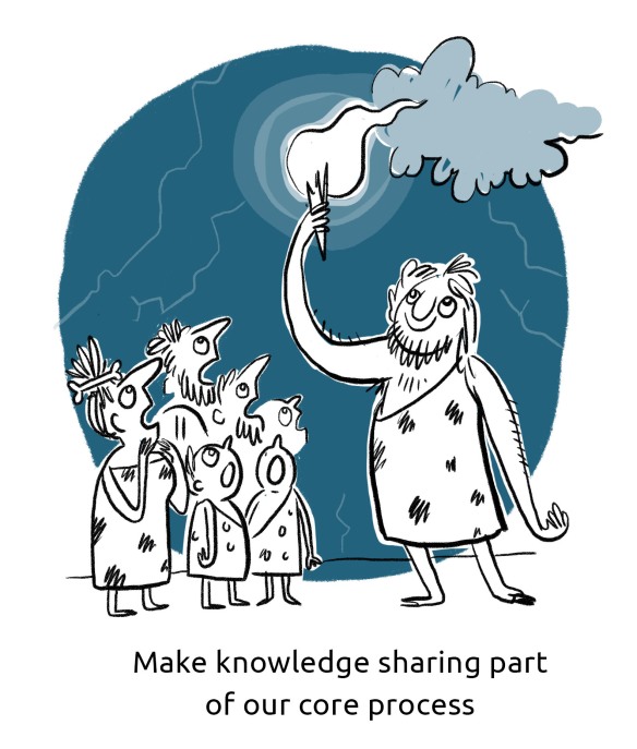
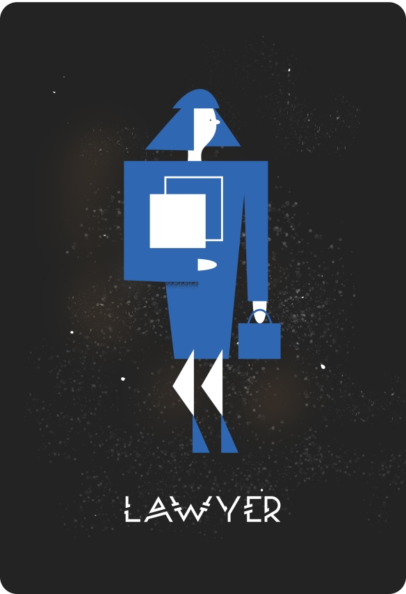
Not just any old illustrations of course. Ramming a load of stock images of smiling people running on a beach at sunset or shaking hands next to a lightbulb is really not going to do the trick. Images like this might be slightly less boring than text on it’s own, but they also smack of laziness and do nothing to delight your viewer. And in the communications business, DELIGHT is King. nemeses.jpg

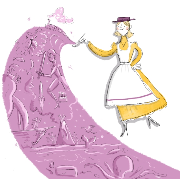
Delight, like Mary Poppin’s spoonful of sugar, often helps the ‘medicine’ go down. Delight is the added sweetness that makes your message more inviting, engaging and memorable. Stock images are not delightful. They’re like they dreary, never-ending stories your grandma tells every time she’s been at the sherry – predictable, dull and meaningless.

gran

Commissioned images on the other hand are like rip-roaring tales told by a skilful raconteur that you can’t peel yourself away from and that keep echoing in your mind long after they’re finished. They are relevant, witty, beautiful and intelligent. They make your client feel cared for, and they are dripping with DELIGHT.

poppins.jpg

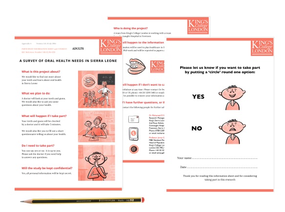
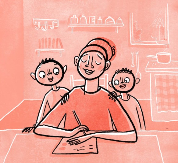
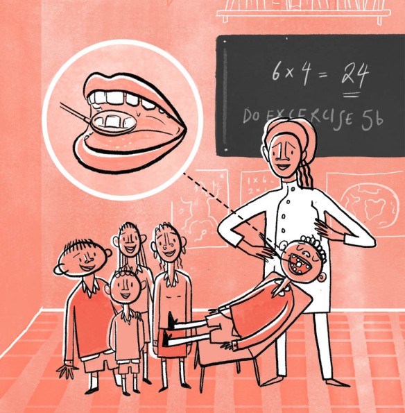
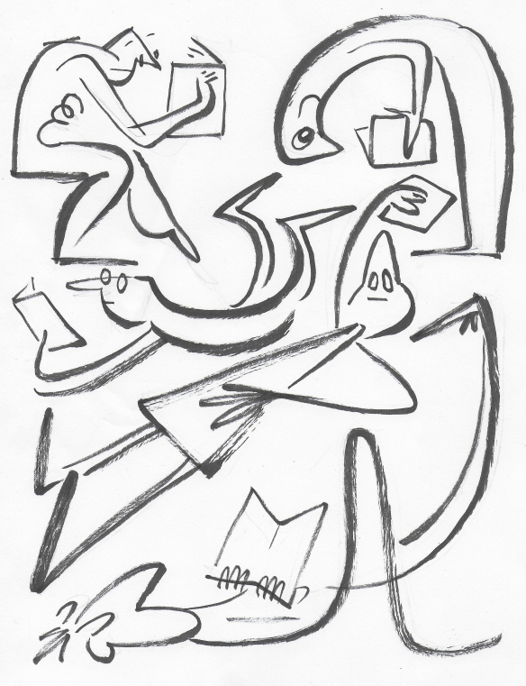
But don’t take my word for it. Using images to get your point across is also scientifically proven to be more effective. Pictures like this may seem daft, but processing images uses a different part of the brain to processing text, so including both in a presentation deck allows the viewer to use multiple parts of the brain at once. It gives the brain some variety of stimulus and allows thrilling new neural pathways to open up. This multi-channel approach actually increases the likelihood of the viewer understanding the information and committing it to memory.

So… FEEL THE RAW POWER OF DELIGHT and strongly consider harnessing the forces of art for your next presentation.slide_167.jpg

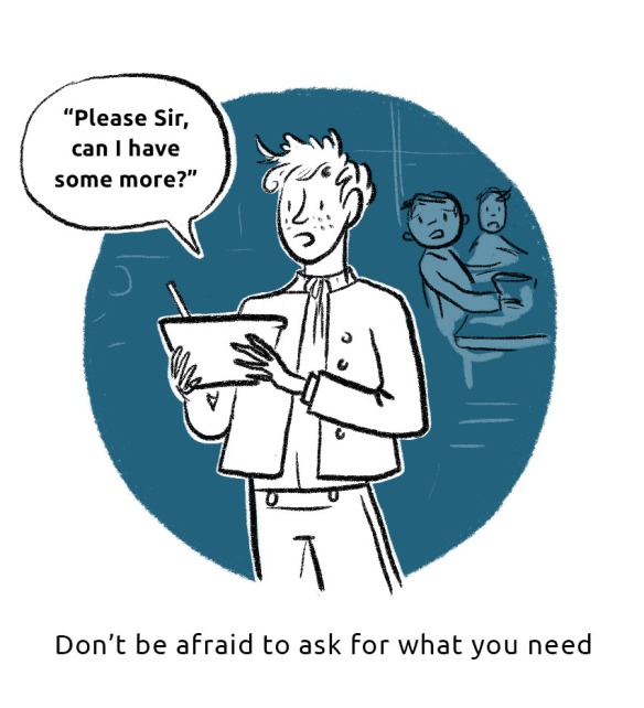
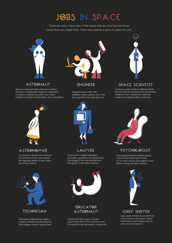
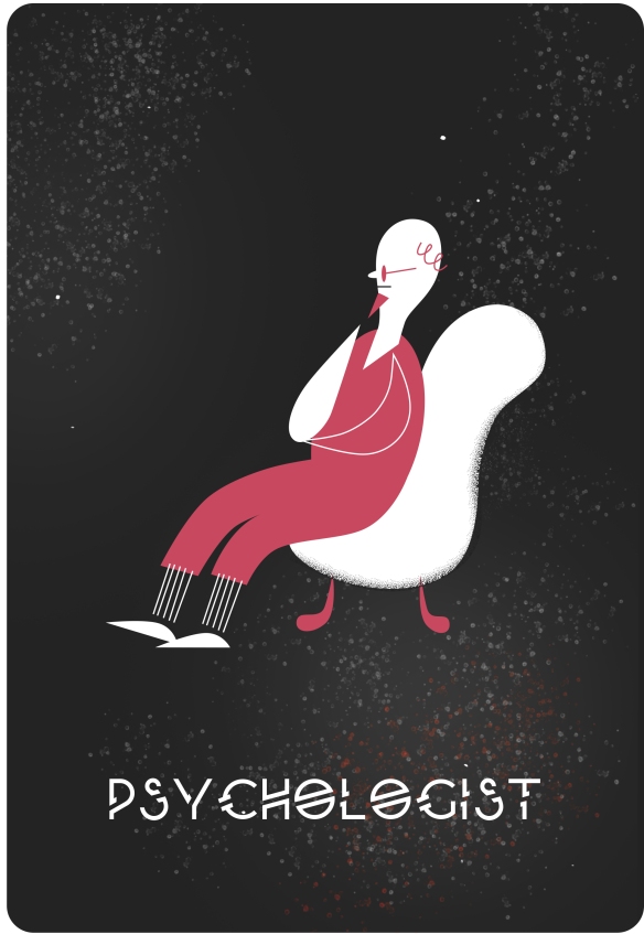
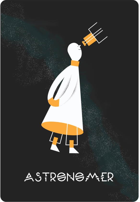
Illustrations made on Photoshop


Clubbing! (book clubbing)

A while back I started a book club and I didn’t want to be a loner with no friends so I made a poster to promote it. (That’s how you get friends right?) People actually came so I was pretty chuffed. We read The Tiger’s Wife which was excellent.

poster-1-smaller-V2.jpg

Here was a sketch in pen of the original layout.

people with books.jpg

this image was made by layering photos, vector images and text in Photoshop.


Graphic Recording Practice & why it’s important

martin Reeves scribe small.jpg
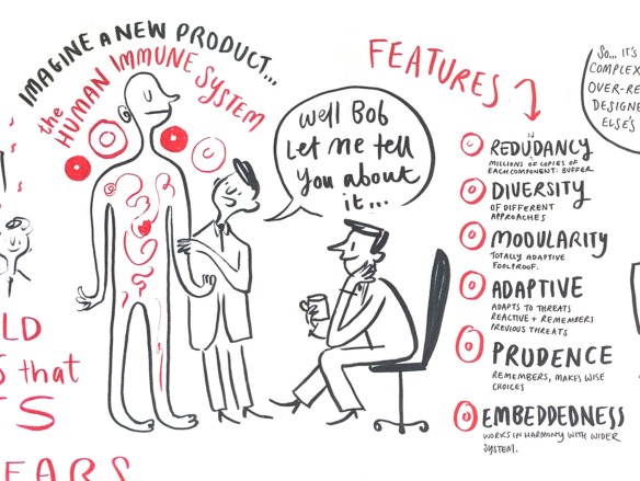
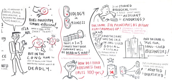
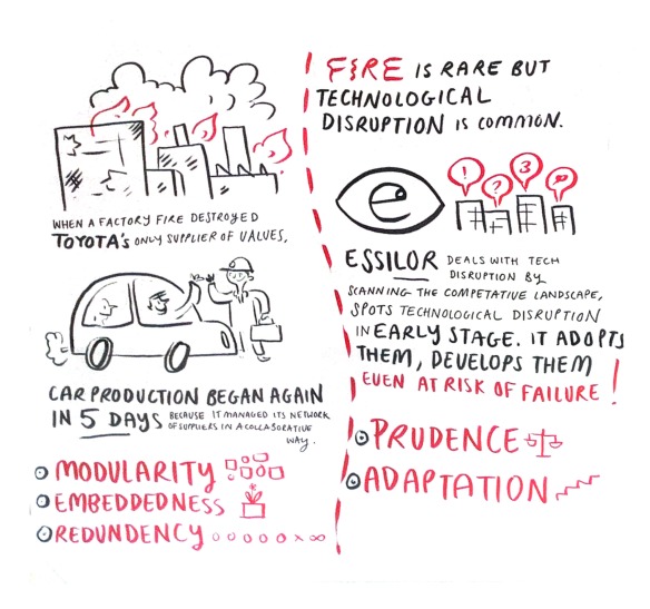
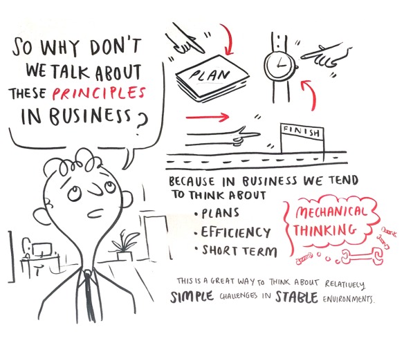
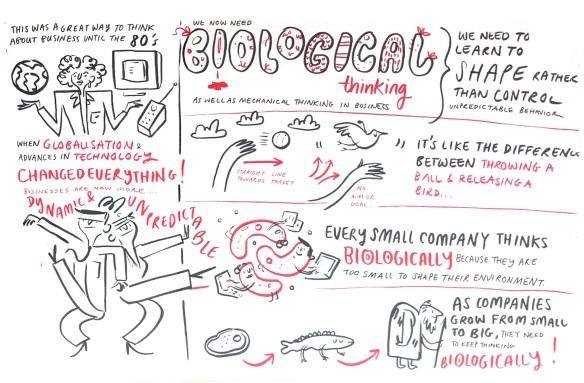
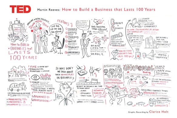
There are 2 reasons to do Graphic Recording practice between paid jobs. 1: to get better (duh) and 2: because the vast majority of client work in this field is Data Protected. Usually you’re working with the top echelons of the company, documenting their strategy and plans for the future, so the content can be a bit top secret. That means absolutely no sharing it on your website on pain of death. As a result, many Graphic Recorders and Facilitators can work solidly for months without anything tangible to show for it (apart from a happy bank manager). So doing the odd ‘practice’ recording is good to keep your hand in, but also useful to show people what you can do. This recording took about 1.5 hours and was then photographed and cleaned up in photoshop to show how it would be delivered to the client.
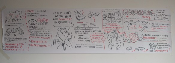
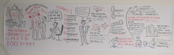
 Here’s the original video.

raw-image1raw image 2.jpgthe originals

100x1.jpg100x5.jpg100x6.jpg100x7.jpg100x8.jpg

made with pens and paper and then cleaned in photoshop


Jobs in Space

space-jobs-v2

Is there are place in space for YOU? Recently I started looking into jobs in space.

(Can you believe there is no such thing as a space illustrator? I know.) We all know about astronauts, but they’re just the cool kids the space world. If you don’t happen to be a superhuman with 2020 vision, a pilot’s licence, a PhD and a hot bod, you can still help chip away at the final frontier. I created some illustrations to help you begin your quest…to infinity and beyond!

space-scientist-with-stars.jpgpsychologist-with-starsAstronaut-with-stars.jpgastronomer-with-starslawyer-with-starsengineer-with-stars.jpg

made in Illustrator and formatted in Indesign


Using Illustration to Help People with Low Literacy Levels Stay Healthy

composite

Rural Sierra Leoneans have very little access to dental care. In order to improve access and raise funds, King’s College London Dental Institute wanted to gather data in the field. But to do so would mean getting permission from rural people who had very low literacy levels and for many of whom, dentistry would be a foreign concept. So the Kings team contacted me to create a simple information sheet and permission form that would empower semi-illiterate people to be part of the project.

From previous experience, the Kings team knew that Sierra Leoneans would not want to take part in the survey or the study unless they felt comfortable and safe. Therefore, the images were to be informative but also fun and warm. They were to reflect the cultural and racial heritage of the people being interviewed. They were also for all ages, so they had to be simple but not too juvenile.

dentist_3_no_writing

Illustrations had to be demonstrative, warm and easy to identify with.

rural_sierra_leone_Telegraph copy.jpg

Colour-wise I originally began with the bright red of the Kings College branding but feared that it was too reminiscent of blood for a dental project! So instead, I took inspiration from the warm reds of the Sierra Leonean soil and used a less saturated tone of the Kings red to soften the colour palette.

sierra-leone-rural

a warm colour palette taken from the rich colour of the Sierra Leonean soil

dentist_2_cropped.jpg

My initial sketch for this project included a ‘thumbs up and down’ — visual shorthand for approval or disapproval. However, after researching symbolic gesture in Sierra Leone I discovered that ‘thumbs up’ can have a very rude meaning indeed in Sierra Leone! We therefore replaced the sign with a universally comprehensible smiling and frowning face.

Although this project involved pretty graphics, its most important goal to help rural Sierra Leoneans understand the survey that was being carried out and help them give their consent. This would give them access dental care and empower them to improve their future health.

I am delighted to say that the project has secured funding and is now going through tests before it is applied in the field. I look forward to the results and incorporating the feedback in my practice!

shh.jpg

Images made in Photoshop and formatted in Indesign


Using Colour More Carefully #1

In my work, I focus on using image and text to aid understanding of and engagement with complex topics. That means packing a lot of meaning into everything. A great deal of thought goes into creating a punchy ideas, clever text, and challenging visuals, but what with deadlines, client input and branding restrictions, colour choices are often low on my list of priorities. I am the first to admit that this approach to colour is craptastic and must be remedied. So regular explorations of new colour palettes are now on the cards. This started recently with two great artistic traditions – messing around with a colour wheel and mercilessly nicking ideas from other people….

1_colour

3b-colour_final

1b_colour_final.jpg

2b_colour_final.jpg

3a

Borrowing and stealing from: Mark Rothko, philatelists, House of Holland & Evelyn Ackerman and Mowgli Omarito name but a few.

Vector Art work made using Illustrator

Illustrations for Friend of the Earth International: the Financialization of Nature

FoN shareable draft 2

Click to access Financialization-of-Nature-brochure-English.pdf

I was asked by Friends of the Earth International to create a set of images to accompany a recent report they produced about the ‘Financialization of Nature’. It was very much a collaborative process, with much input from their side, as they were keen that the final result should be immediately visually impactful, and move people to read further and engage with the topic. The pallet used was bright and the imagery bold, to match the overall look and feel of their campaign design.

‘Financialization of Nature’ is a very scary thing. We are assured that governments are restricting the damage that corporations can do to the environment through a ‘biodiversity offsetting’ system. This essentially means that if one area of the nature is destroyed, another area of the same size must be established elsewhere. Sounds OK on paper, but in reality this practice is pretty much meaningless. Ancient forest, rich in biodiversity, habitat for infinite species of animal, plant, fungus and bacteria can, under this system, be destroyed and replaced by grassland or young trees – the rich, old land replaced by young land that can support little life. Not to mention that there can be huge gaps in time and place. The new land need not be created immediately, nor does it have to be close to the old. What happens to the life that lives on the land that is destroyed? There is no half-way house for it to dwell in while it waits for a new habitat. It dies, long before the new habitat is created – a habitat that is too distant and too simple to support it anyway. And in many cases, with very few organisations policing the system, the new land is never created at all.

Screen Shot 2015-11-11 at 11.12.40

Because the wheels of Capitalism spin on and on faster and faster, brilliant minds have concluded that the natural world will only be saved if we treat nature as a commodity, just like everything else. Forests, rivers, wetlands etc are rebranded ‘Ecosystem Services’ to be bought and traded. Nature is carved up into pieces in order to give it ‘worth’ to corporations who might otherwise destroy it. But nature is one system, a synergy, each element depending on another. Some easily tangible elements are given value – carbon, water, peat, whilst other more nebulous ones are not. A company can destroy 1000 trees in one area and replant them in another, but what happens to the millions of lives, the indigenous peoples, the delicate, intricate ecosystems what lived surrounding those trees?The company washes its hands and walks away with ‘clean conscience’.

Screen Shot 2015-11-11 at 11.13.51

We must attempt to change things for the better – but we must also recognise a scam when we see one. This system does little to prevent biodiversity loss. For those who feel guilt, it helps alleviate it and for those who feel none, it turns nature into two things: commodities to be bought and irrelevancies to be ignored.

As a species we are used to using our surroundings for our own ends. We see short term comfort and ignore long term ruin. As our world becomes more difficult to live in, will be change our ways? Will we change in time? After so long at the top, perhaps it is not possible to think differently. Perhaps success relies on appealing to our inner capitalist, but it also relies on us telling the truth about what works and what doesn’t, facing our guilt and pushing to find a real solution.

The UNHCR Nansen Awards : Who Was Fridtjof Nansen?

nansen colour with quote Small

This illustration was to help the UNHCR spread the word about the upcoming Nansen Awards that honour extraordinary service to the forcibly displaced.

Fridtjof Nansen was an extraordinary polymath, the founding father of the UNHCR and basically a dude in all respects. Reading about him for this project has left me a bit in awe. Here’s a quote that gives you an idea of the sort of man he was. So bleak and so magnificent

“Here I sit in the still winter night on the drifting ice-floe, and see only stars above me. Far off I see the threads of life twisting themselves into the intricate web which stretches unbroken from life’s sweet morning dawn to the eternal death-stillness of ice. Thought follows thought—you pick the whole to pieces, and it seems so small—but high above all towers one form … Why did you take this voyage? … Could I do otherwise? Can the river arrest its course and run up hill? My plan has come to nothing. That palace of theory which I reared, in pride and self-confidence, high above all silly objections has fallen like a house of cards at the first breath of wind. Build up the most ingenious theories and you may be sure of one thing—that fact will defy them all. Was I so very sure? Yes, at times; but that was self-deception, intoxication. A secret doubt lurked behind all the reasoning. It seemed as though the longer I defended my theory, the nearer I came to doubting it. But no, there is not getting over the evidence of that Siberian drift-wood. But if, after all, we are on the wrong track, what then? Only disappointed human hopes, nothing more. And even if we perish, what will it matter in the endless cycles of eternity?”

NB: It is a bit naughty to put penguins in here as they only live in the South Pole and Nansen never got there…apologies to strict ornithologists.

Scenes from San Francisco

So I spent the last two and a half months in San Francisco unable to do any paid work, accompanied by the unnerving sound of a gradually dwindling bank account. Since I’ve been back I have been doing some things which I will soon post. In the meantime here is a typical San Francisco scene (we were living in Mission) butt

Illustration for the UN High Commission for Refugees and UNIQLO

Here is an illustration I did to celebrate the partnership of the UNHCR and UNIQLO and the benefits for refugees. What a cool company!

UNHCR uniqlo FINAL small Clarice Holt

Ali Mohammad, 32, comes from Hama, the fourth-largest city in war-torn Syria. He fled with his wife and their four small children (two boys, two girls).

Since they had to leave quite suddenly, they escaped with little more than the clothes on their backs. They walked for days to reach the border, crossing rugged and dangerous terrain along the way. Without jackets or jumpers, it was very cold.

Now the young family are safe in Jordan’s Azraq refugee camp, where they received clothes donated by our long-standing partner, UNIQLO.

Ali and his wife, and their four young children, look forward to the day when they can return to Syria – and make use of their washing line back home.

See it on the UNHCR account HERE