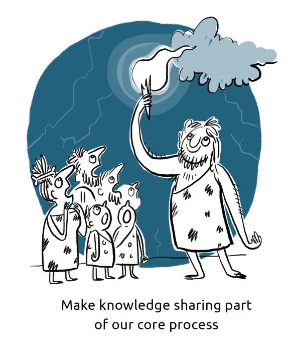
Use images to delight your audience and they might just learn something…

Everything I have to say is VERY interesting and important and it’s probably the same with you. So why risk presenting your pearls of wisdom and rubies of wit to people in a way that will cause them to flee the room in fits of bored tears? It is well known that human brains tend to switch off after a certain amount of one particular stimulus and that most people learn better visually than they do through words alone.  So how can you expect people to remain focused on 465,000 slides of text delivered in a warm room on a Friday afternoon? Open the windows, give everyone a fortifying biscuit and COMMISSION ILLUSTRATIONS for your presentation. slide_235.jpg
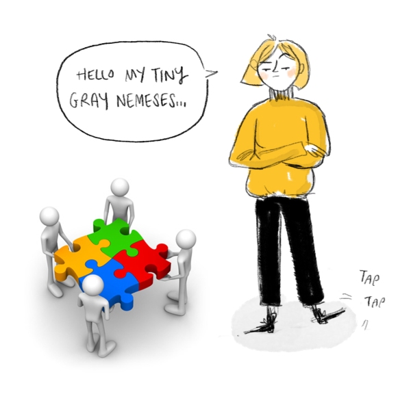
Not just any old illustrations of course. Ramming a load of stock images of smiling people running on a beach at sunset or shaking hands next to a lightbulb is really not going to do the trick. Images like this might be slightly less boring than text on it’s own, but they also smack of laziness and do nothing to delight your viewer. And in the communications business, DELIGHT is King. nemeses.jpg
Delight, like Mary Poppin’s spoonful of sugar, often helps the ‘medicine’ go down. Delight is the added sweetness that makes your message more inviting, engaging and memorable. Stock images are not delightful. They’re like they dreary, never-ending stories your grandma tells every time she’s been at the sherry – predictable, dull and meaningless.
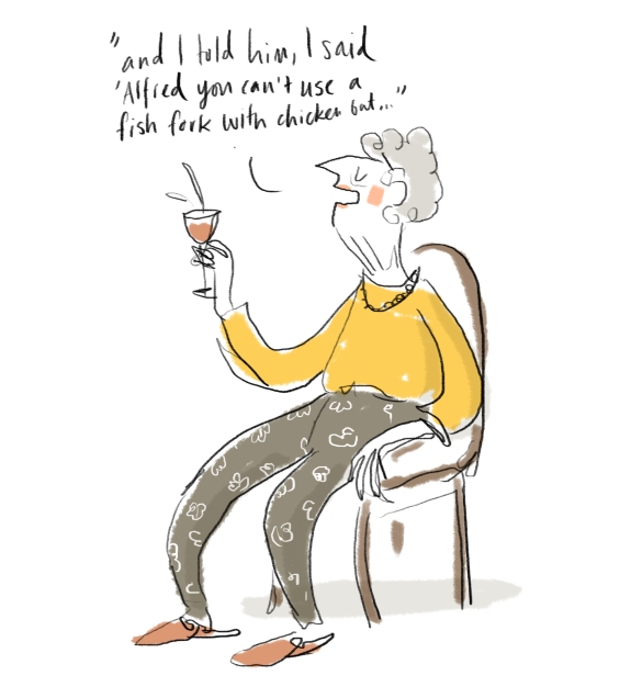
gran

Commissioned images on the other hand are like rip-roaring tales told by a skilful raconteur that you can’t peel yourself away from and that keep echoing in your mind long after they’re finished. They are relevant, witty, beautiful and intelligent. They make your client feel cared for, and they are dripping with DELIGHT.
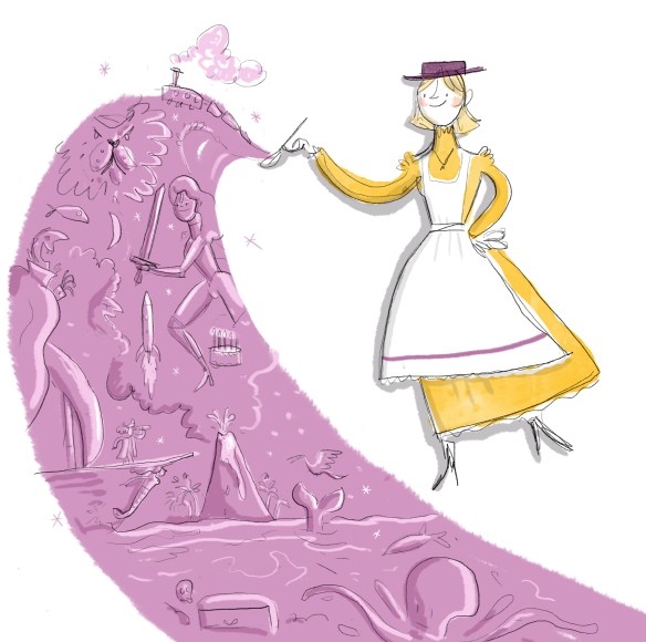
poppins.jpg

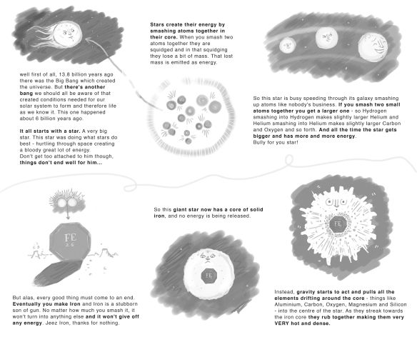
But don’t take my word for it. Using images to get your point across is also scientifically proven to be more effective. Pictures like this may seem daft, but processing images uses a different part of the brain to processing text, so including both in a presentation deck allows the viewer to use multiple parts of the brain at once. It gives the brain some variety of stimulus and allows thrilling new neural pathways to open up. This multi-channel approach actually increases the likelihood of the viewer understanding the information and committing it to memory.

So… FEEL THE RAW POWER OF DELIGHT and strongly consider harnessing the forces of art for your next presentation.slide_167.jpg
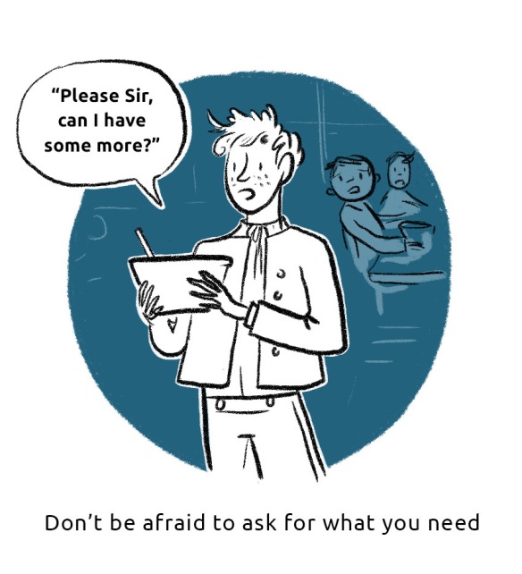
Illustrations made on Photoshop


Clubbing! (book clubbing)

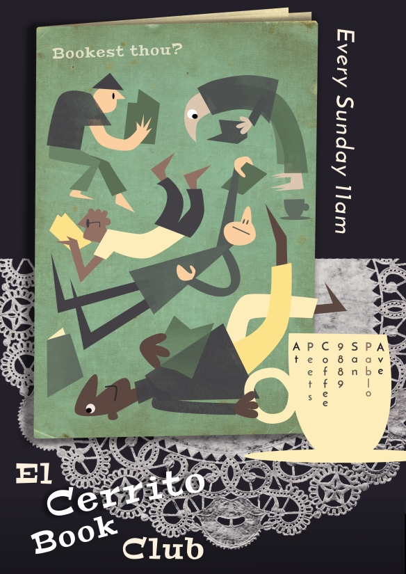
A while back I started a book club and I didn’t want to be a loner with no friends so I made a poster to promote it. (That’s how you get friends right?) People actually came so I was pretty chuffed. We read The Tiger’s Wife which was excellent.

poster-1-smaller-V2.jpg

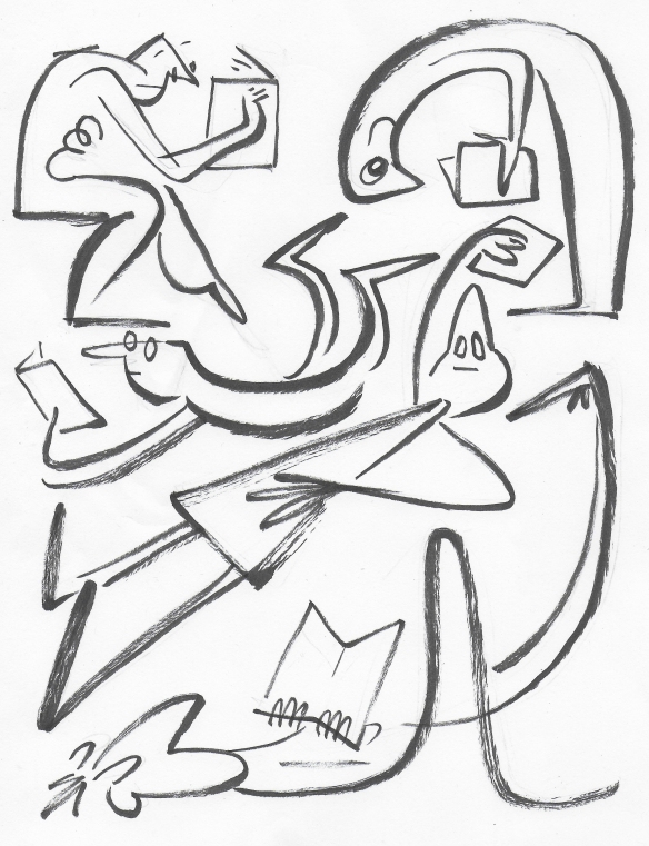
Here was a sketch in pen of the original layout.

people with books.jpg

this image was made by layering photos, vector images and text in Photoshop.


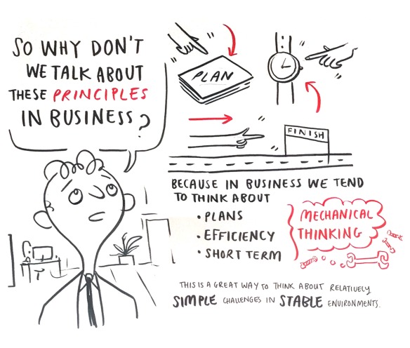
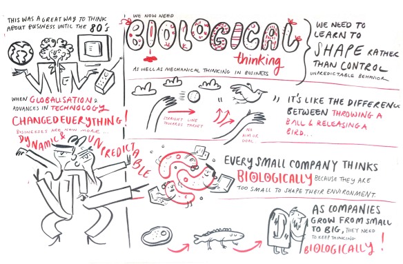
Complex Visual Problem Solving

A client recently took a look at my blog, made a confused face and said he couldn’t work out what the key theme of all my work was. Not great. I spend so much time trying to communicate on the part of others, I had obviously neglected to communicate my own message.  So I decided to make it really clear by summing it up in one sentence:

I CREATE IMAGES AND TEXT THAT HELP PEOPLE ENGAGE WITH COMPLEX CONCEPTS.

That could mean posters, fliers, live graphic recording at events, pitches etc, infographics, social media posts, blog material. I work in various sectors, primarily business, education and charity, helping my clients spread their messages.

Essentially, you give me your problem concerning communication of your idea and I give you a visual solution to that problem. I can draw but more importantly I CAN THINK. That’s really what you’re paying me for. I listen to you, ask questions about your organisation, your clients, your project and then I provide you with something that will really help you break through all the noise out there. It’s not just a lovely drawing, its something witty as well as pretty and it will make people look again at what you have to say.

And why is that important? These days we are all constantly bombarded with bla bla bla, every second of the day from every angle. I aim to make work that is not bla in any way. Instead of being easy to consume, it has a little edge, asks a little bit from the viewer. I try to compel the viewer to look again, to get the joke, to connect the dots. I believe it’s good to make people work a bit and flex their ‘little grey cells’ – they feel respected, and they appreciate the challenge.

So I hope that explains clearly what the whole point of me is. If you have any questions please don’t hesitate to ask!

martin-reeves-scribe-small

Graphic Recording Practice & why it’s important

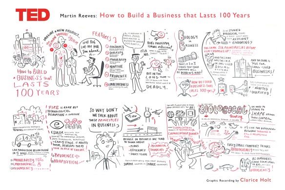
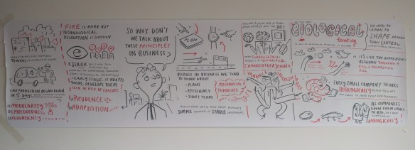
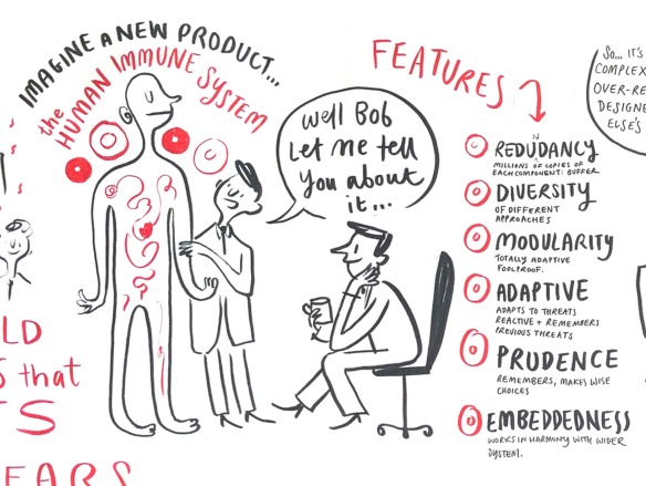
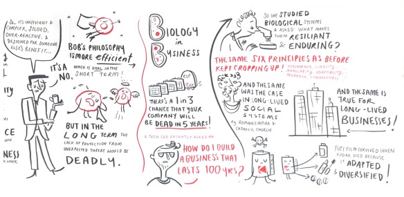
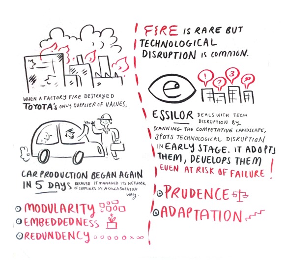
martin Reeves scribe small.jpgThere are 2 reasons to do Graphic Recording practice between paid jobs. 1: to get better (duh) and 2: because the vast majority of client work in this field is Data Protected. Usually you’re working with the top echelons of the company, documenting their strategy and plans for the future, so the content can be a bit top secret. That means absolutely no sharing it on your website on pain of death. As a result, many Graphic Recorders and Facilitators can work solidly for months without anything tangible to show for it (apart from a happy bank manager). So doing the odd ‘practice’ recording is good to keep your hand in, but also useful to show people what you can do. This recording took about 1.5 hours and was then photographed and cleaned up in photoshop to show how it would be delivered to the client. Here’s the original video.

raw-image1raw image 2.jpgthe originals

100x1.jpg100x5.jpg100x6.jpg100x7.jpg100x8.jpg

made with pens and paper and then cleaned in photoshop


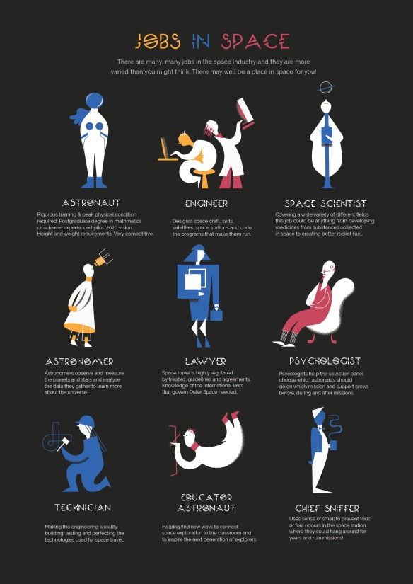
Jobs in Space

space-jobs-v2

Is there are place in space for YOU? Recently I started looking into jobs in space.

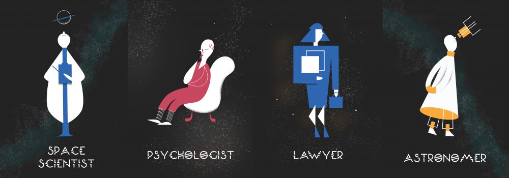
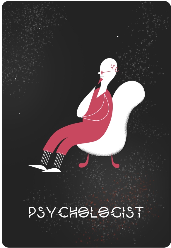
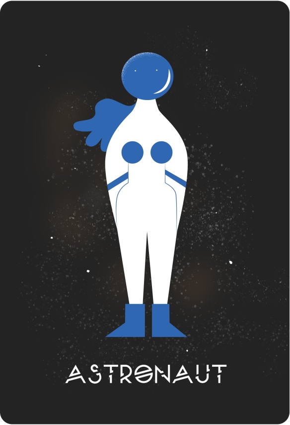
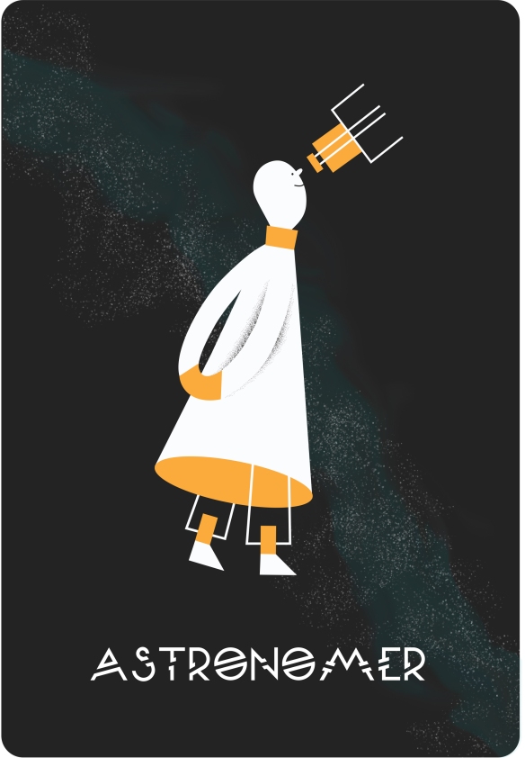
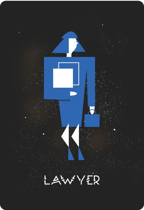
(Can you believe there is no such thing as a space illustrator? I know.) We all know about astronauts, but they’re just the cool kids the space world. If you don’t happen to be a superhuman with 2020 vision, a pilot’s licence, a PhD and a hot bod, you can still help chip away at the final frontier. I created some illustrations to help you begin your quest…to infinity and beyond!

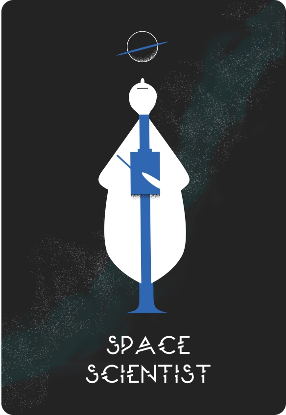
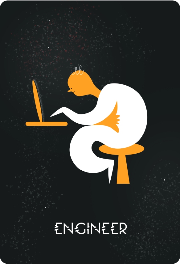
space-scientist-with-stars.jpgpsychologist-with-starsAstronaut-with-stars.jpgastronomer-with-starslawyer-with-starsengineer-with-stars.jpg

made in Illustrator and formatted in Indesign


Using Illustration to Help People with Low Literacy Levels Stay Healthy
composite

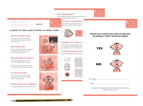
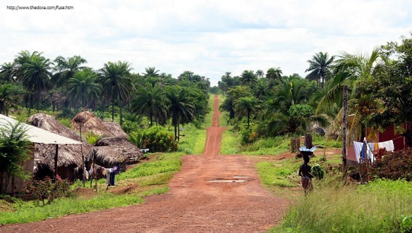
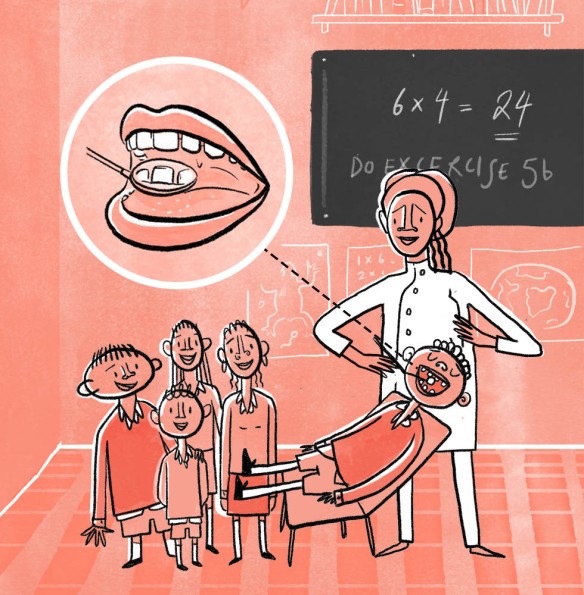
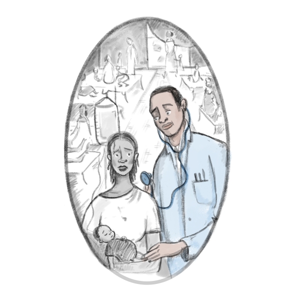
Rural Sierra Leoneans have very little access to dental care. In order to improve access and raise funds, King’s College London Dental Institute wanted to gather data in the field. But to do so would mean getting permission from rural people who had very low literacy levels and for many of whom, dentistry would be a foreign concept. So the Kings team contacted me to create a simple information sheet and permission form that would empower semi-illiterate people to be part of the project.
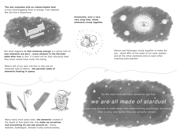
From previous experience, the Kings team knew that Sierra Leoneans would not want to take part in the survey or the study unless they felt comfortable and safe. Therefore, the images were to be informative but also fun and warm. They were to reflect the cultural and racial heritage of the people being interviewed. They were also for all ages, so they had to be simple but not too juvenile.

dentist_3_no_writing

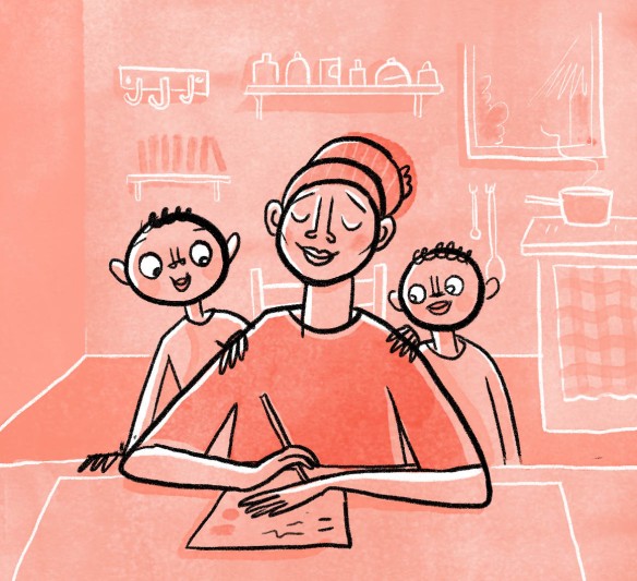
Illustrations had to be demonstrative, warm and easy to identify with.

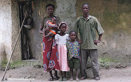
rural_sierra_leone_Telegraph copy.jpg

Colour-wise I originally began with the bright red of the Kings College branding but feared that it was too reminiscent of blood for a dental project! So instead, I took inspiration from the warm reds of the Sierra Leonean soil and used a less saturated tone of the Kings red to soften the colour palette.

sierra-leone-rural

a warm colour palette taken from the rich colour of the Sierra Leonean soil

dentist_2_cropped.jpg

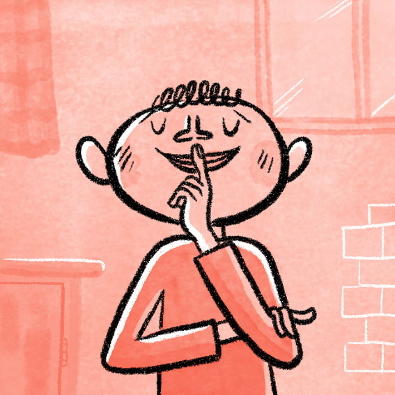
My initial sketch for this project included a ‘thumbs up and down’ — visual shorthand for approval or disapproval. However, after researching symbolic gesture in Sierra Leone I discovered that ‘thumbs up’ can have a very rude meaning indeed in Sierra Leone! We therefore replaced the sign with a universally comprehensible smiling and frowning face.

Although this project involved pretty graphics, its most important goal to help rural Sierra Leoneans understand the survey that was being carried out and help them give their consent. This would give them access dental care and empower them to improve their future health.

I am delighted to say that the project has secured funding and is now going through tests before it is applied in the field. I look forward to the results and incorporating the feedback in my practice!

shh.jpg

Images made in Photoshop and formatted in Indesign


Using Colour More Carefully #1

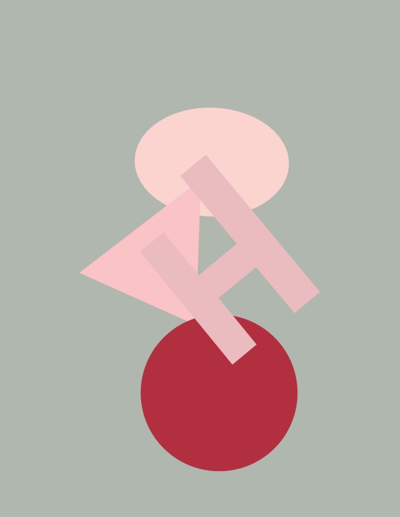
In my work, I focus on using image and text to aid understanding of and engagement with complex topics. That means packing a lot of meaning into everything. A great deal of thought goes into creating a punchy ideas, clever text, and challenging visuals, but what with deadlines, client input and branding restrictions, colour choices are often low on my list of priorities. I am the first to admit that this approach to colour is craptastic and must be remedied. So regular explorations of new colour palettes are now on the cards. This started recently with two great artistic traditions – messing around with a colour wheel and mercilessly nicking ideas from other people….

1_colour

3b-colour_final

1b_colour_final.jpg

2b_colour_final.jpg

3a

Borrowing and stealing from: Mark Rothko, philatelists, House of Holland & Evelyn Ackerman and Mowgli Omarito name but a few.

Vector Art work made using Illustrator

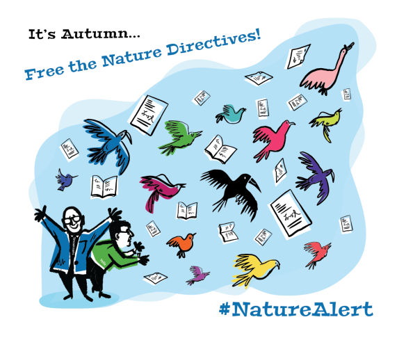
Free the Nature Directives!

BirdLife-Final-Small-V2.png

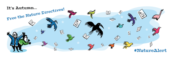
Here are some illustrations I did for BirdLife International. They are calling upon Commissioner Vella and Vice President Timmermans of the European Commission (in as nice a way as possible) to release the results of the ‘Fitness Check of the Nature Directives’ and validate them as fit for purpose. It was supposed to be done in Autumn, and they recon it’s now Autumn so they’re using my illustrations in a campaign to give the Commissioners a nudge! Here are the final results:

BirdLife-Final_Banner-V1.png

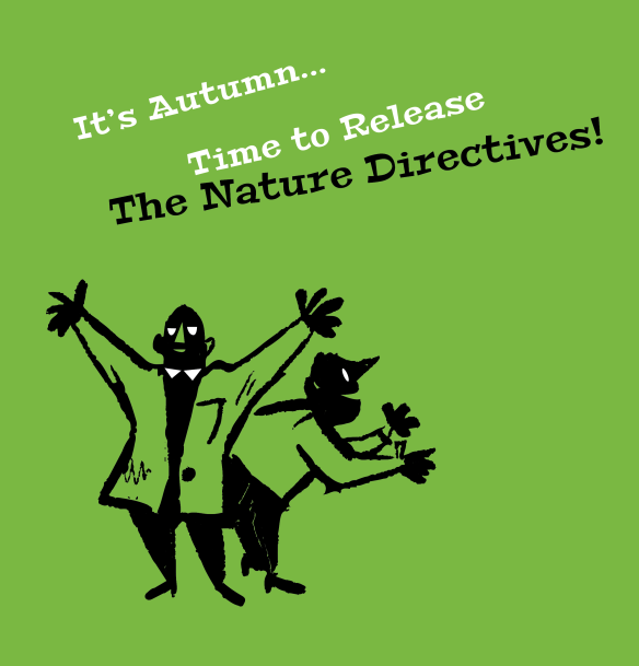
This illustration started off way weirder (see below) before I was told that Timmermans and Vella should look less scary…

birdlife-v3.png

Now they are sweethearts!

Untitled-5.png


Promotional Work for the UN – Nansen Refugee Award 2016

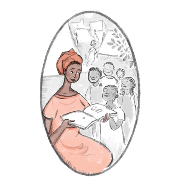
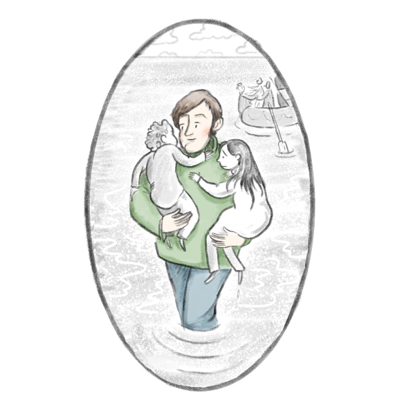
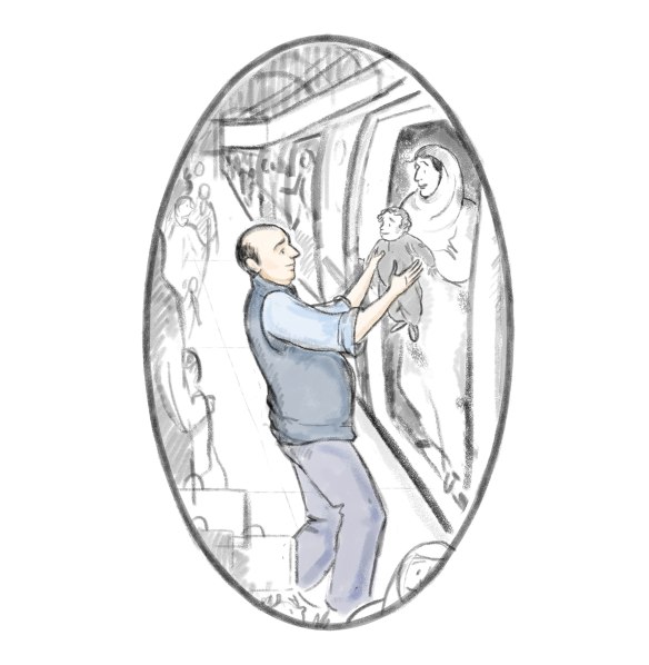
The UN asked me to create some images to promote the search for the next Nansen Refugee Award winner, so here they are. They want to hear about any individual who provided an extraordinary service to the forcibly displaced.

Nominate here: https://www.surveymonkey.com/r/KPNRJFQ


4

2

1

3